Open. Humble. Helpful.
Willow’s values – or more suitably, their pledge – are what make the agency stand out amongst Indianapolis marketing and advertising organizations. As visitors to their studio, we got a chance to understand how Willow’s pledge matches the quality of their work and echoes a fun work environment that reflects their unique style and approach.
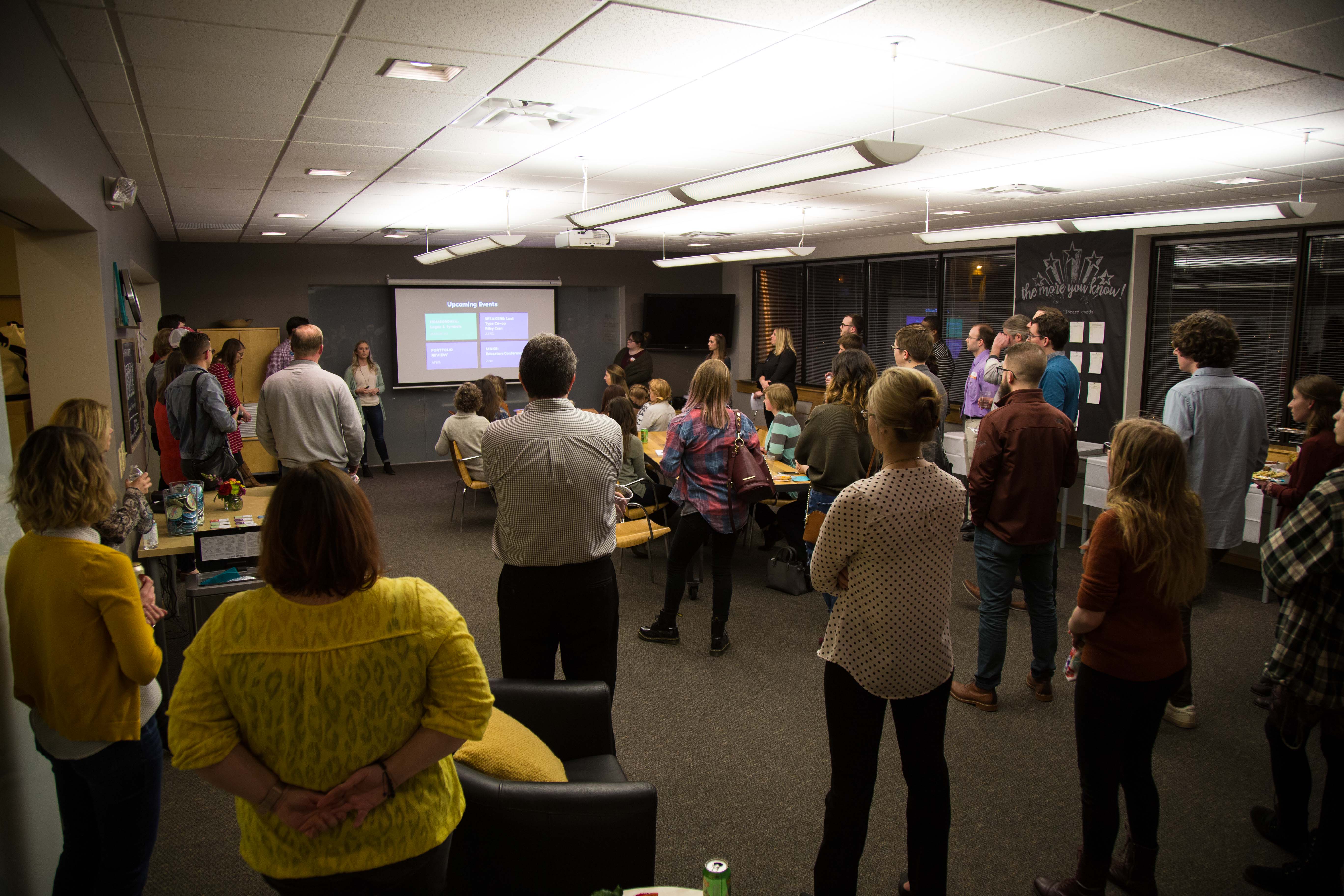
Willow’s first-floor conference room
Willow’s first-floor interior space takes advantage of repurposed and prefabricated infrastructure previously belonging to a retail department store. Large showcase windows are now sliding doors leading into the agency’s main conference room. Tall room dividers – which may have been used in their past life to hang hats, gloves or other accessories – now proudly display some recent client work. Presented on a repurposed wall, the evolution of Willow’s logo and brand was laid out before us in a sequence of early sketches and ideas.
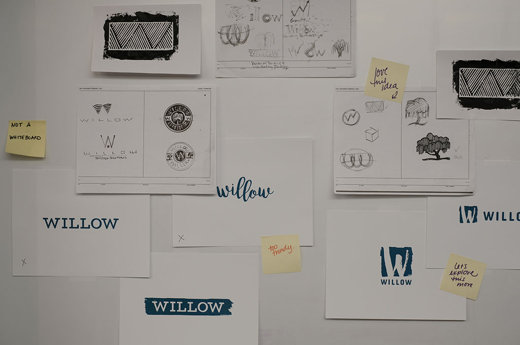
Willow’s early brand sketches
Every person on the Willow team has a unique logo conceived and sketched during their onboarding process. Each person’s logo is a line drawing representation of their role and personality. Before the tour began, Willow gave us a hint of what it feels like to be on their team by inviting visitors to sketch their own original logo.
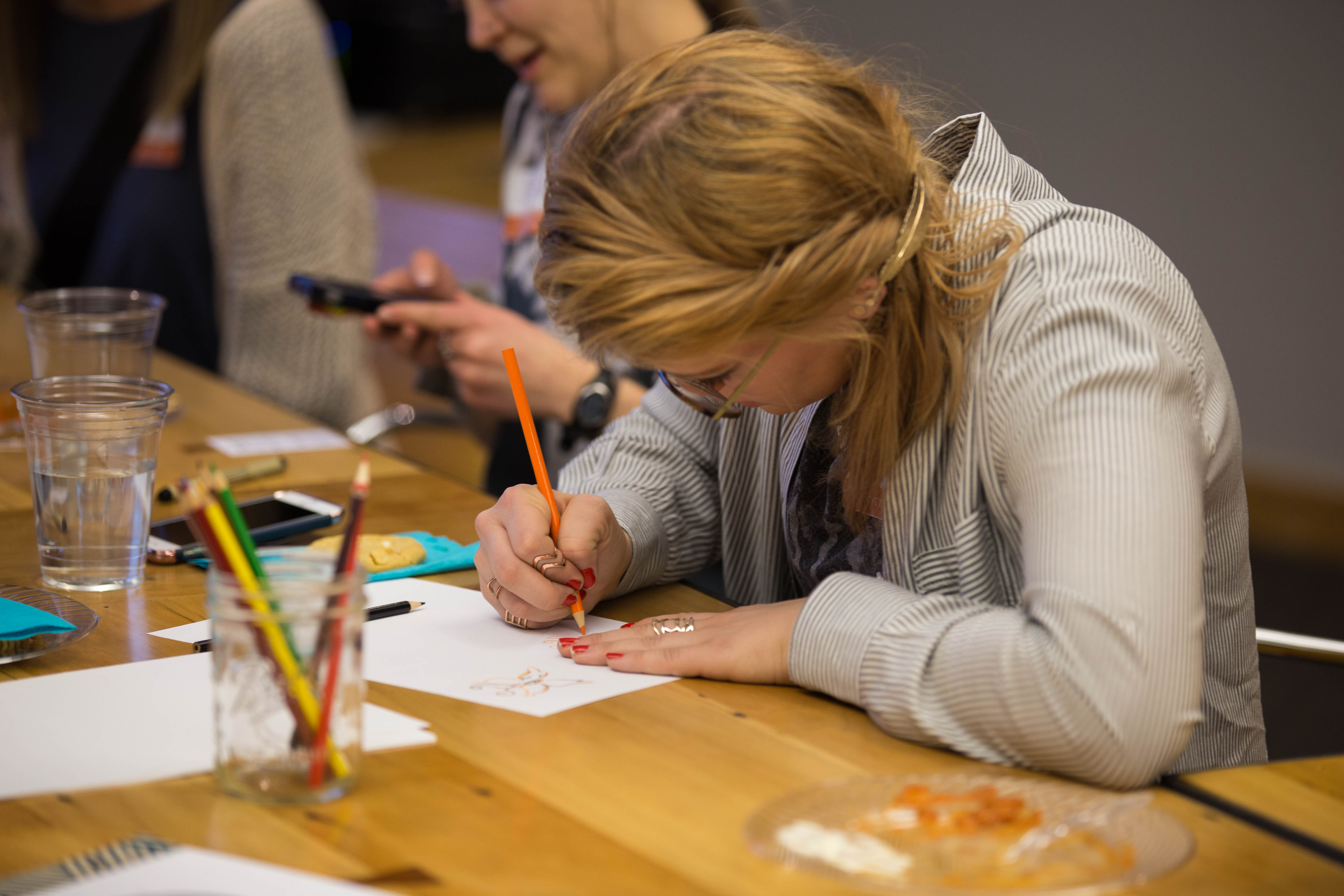
Visitors were encouraged to create their own unique logo
In the conference room, colored pencils, pens, and small cards were laid before us on modest-sized industrial tables. Inviting visitors to sketch their own logo exemplified Willow’s openness and humility as an organization. After separating into small groups, we were led to the second floor – each group guided by a member of the Willow team.
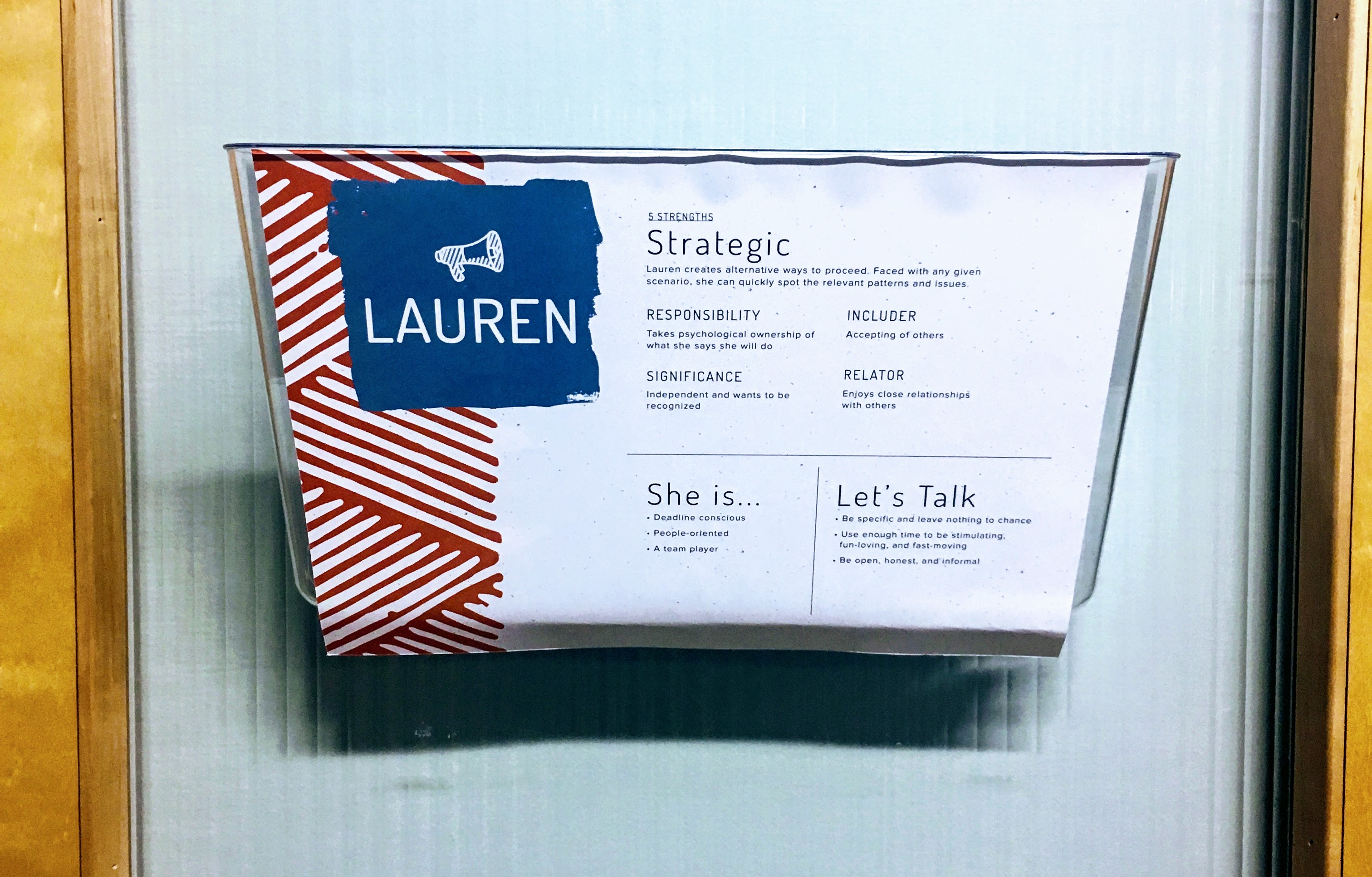
The second floor’s living room-sized communal space is appropriately equipped with a television, bar, lounge furniture, and a foosball table. Private offices surround the space, reminiscent of a college office building. While the offices allowed for privacy, each felt welcoming, as if one could walk into any of the offices like a student meeting with a professor during office hours. Hanging near each office entry, fun and interesting information were listed about the occupant.
Past the bar on the second floor, the tour led into a collaborative creative space. On a wall, Willow had displayed past ideas and concepts that weren’t chosen by clients. While the wall was full of unchosen work, the wall gives new meaning to work that goes unchosen. Perhaps most importantly, the unchosen work exists as a resource for inspiration – maybe to pick up and refine old ideas and make them work for other clients. The work also serves as a reminder to provide clients diversity in their options. Although only one of many may be selected, the unchosen work can provide valuable lessons to be learned, ultimately leading to improved quality of work.

Visitors gazing the Wall of Perception
Throughout our tour, Willow did an excellent job of letting us know who they are as hosts and a team of creatives. From inviting us to create our own unique logos, to showing us some of their best client work and concepts, Willow taught us that it takes more than having good ideas and a good business model to succeed as a marketing agency. While both idea generation and sustaining a business model are important, Willow relies on transparency and humility as a force for kindling creativity and providing quality service to their clients.