Dan Gneiding and Riley Cran visited us in April 2018. They were funny, charismatic and just an overall joy to spend time with. Here’s a little bit of what we learned while they were here.
Dan Gneiding:
He goes by Grayhood because he always wears a gray hood. It’s true. He was even wearing a gray hood as he presented.
He was hired by Anthropologie right out of school. On his first day he was asked to design the Anthropologie logo. In addition to “accidentally” creating the Anthropologie brand, he was a private label designer for Anthropologie and Urban Outfitters. There he designed brands and labeling along with product packaging designs.
While working there, he was asked to design the first app for UO. Apparently all the developers were busy at the time. His design looked like something from the original Macintosh computer. 8-bit, all the way. He also threw in some easter eggs, like an 8-bit disco ball that drops down if you stayed on a screen too long.
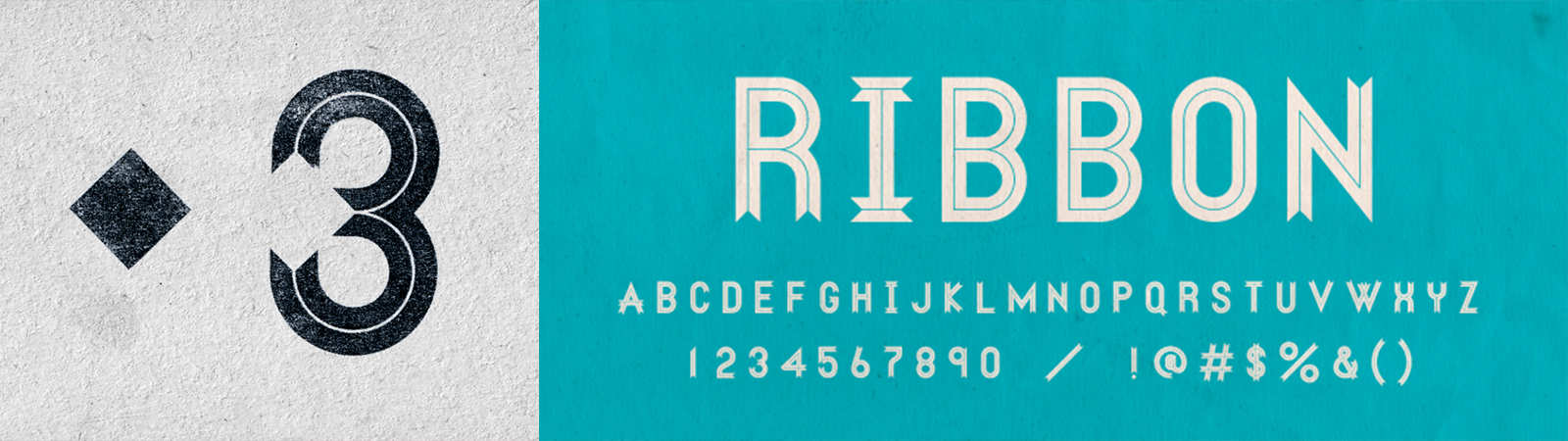
It was at Anthropologie/ Urban Outfitters, where he started to find his love for custom lettering. He joined some online Alphabattles curated by Lettercult. On one such occasion, Riley Cran reached out to him to see if he would make an entire font in the style of a 3 that he created. We now know it to be called Ribbon, well, because it looks like a ribbon. And that’s how he became a type designer for Lost Type.
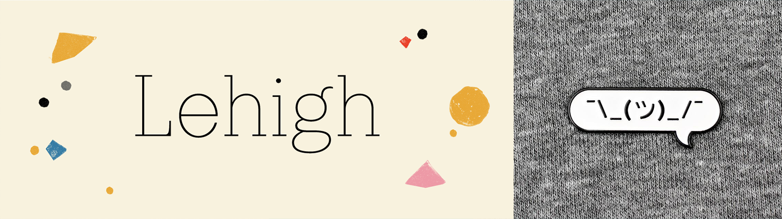
Since then he has created the Dude family, which is inspired by wood type. The names of the font variants pay homage to country musicians from days of ole – Hank, Willie, Loretta, Patsy, and the list goes on. He is currently working on the Lehigh Sans family. It is closely related to Lehigh Slab, which has multilingual support in over 150 languages. This font has so many characters that the ASCII emoticon possibilities are endless! Check out more of Dan’s work.
Riley Cran:
Riley Cran is practically an encyclopedia for typography. But of course, he is. He operates and manages LostType Co-op. He creates custom fonts for big brands. He even researches old lettering designers, that you literally have never heard of.
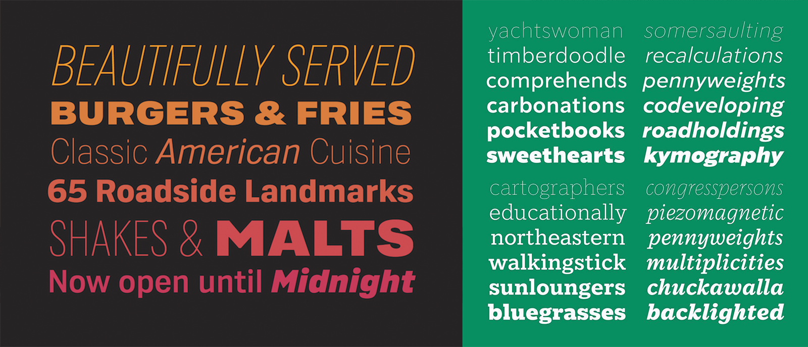
The big brands Riley has created custom typography for include Sonic Drive-In and Starbucks. He is passionate about font legibility and strives to create a better reading experience for everyone — no matter the size or location of the text. Most of the common typefaces these days are scaled proportionally. So that if you compare a font at 12pt with the same font at 48pt, it will look the same – only bigger. This makes fonts easy to produce. However, the font is not as legible as it could be at all sizes. Riley creates type that is legible and graceful no matter what.
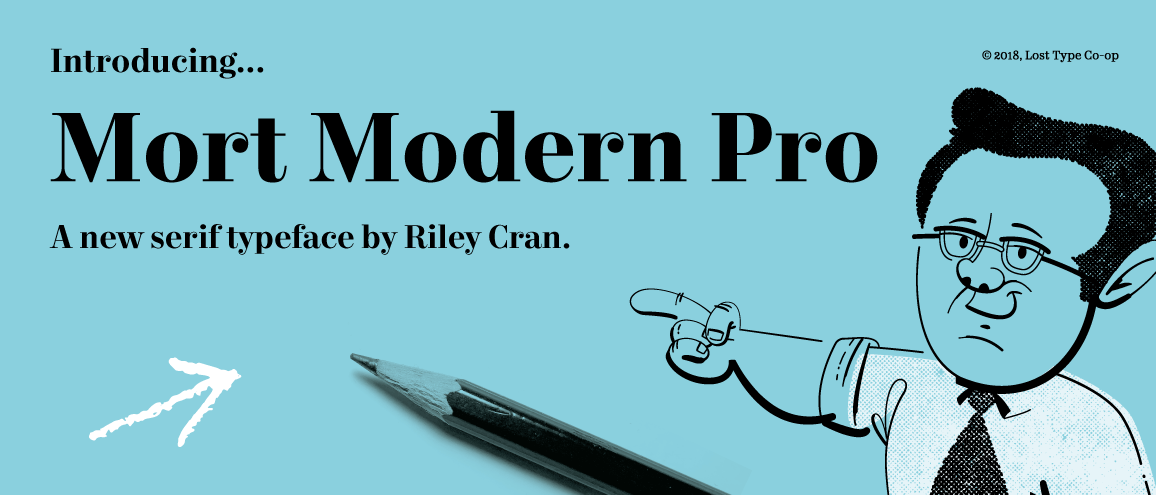
One of his many inspirations is a mid-century lettering artist that most people haven’t heard of: Mortimer “Mort” Leach. Riley spoke at length about the modest, and forgotten, lettering artist and teacher, who helped create a lasting legacy of awesome type in our country. Mort was so forgotten, it took Riley 3 years to find his only living daughter. His daughter was one of the only people alive that could give Riley any information about Mortimer. During his search, he studied the teachings of Mort and modeled a font after it: Mort Modern Pro. If you ever get the chance, ask Riley Cran about his search for information about Mortimer. It’s a good story. In the meantime, check out Riley’s online portfolio.